
(Click to enlarge)
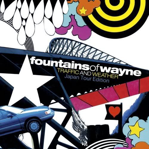
Fountains of Wayne latest album is traffic and weather. The bands music usually consistsof strong melodies, crisp vocal harmonies, economical arrangements and prominent guitar riffs. This makes their songs fairly upbeat and it sounds joyful, this is shown in there music videos as well as there digipak and promotional poster. The art cover is full of bright colours and sharp edges which represents the genre.
On the digipak it displays the bands name and the album name but does not contain anymore words. The bands name is all displayed in lower case, this is also the same in the promotional poster which shows it is part of the design of there name. This could connote that they are not trying to be special and are just there for the music. The majority of the album art is Non representational graphic signs. It does not have any pictures of the band, this is the same in all of the other albums that Fountains of Wayne have released, examples include Utopia Parkway, Welcome interstate managers and Fountains of Wayne (album name). The lack of image could show that the image of the band are not important and that it is all about the music. Instead, the album art cover is a representation of the album name, Traffic and Weather. It shows a montage of 'cartoon' images with very few actual photographs. There is a photo of a bridge dominating the album art and a picture of the car. This represents the traffic. The rest of the album art is all graphics added in by a computer. They are strong in colours which could represent the upbeat tempo of their songs. Clouds, rains and stars are also seen which represents the weather part of the album name. All of this anchors the album name and gives meaning to the images.
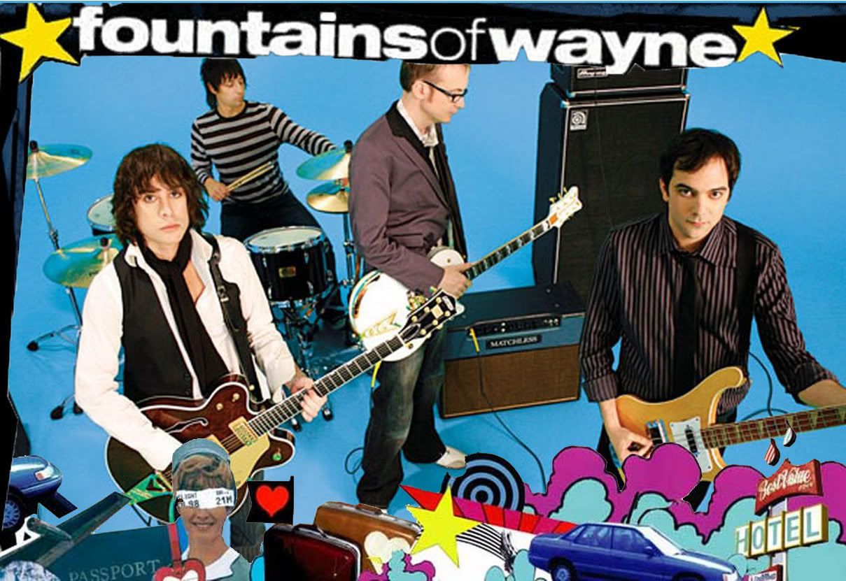
The poster on the other hand is a picture of the band and there instruments. We can tell that this poster is a subsidiary to the album as it has a similar theme to it. The band is holding their instruments but only 2 of them are looking into the camera. It is difficult to distinguish to who is the leader of the band as there are 2 people looking into the camera but they are not in the centre of the image, just behind them there is a man in the centre of the image but is not looking at the camera. I would say that the man in the middle is the leader as he is at the centre of the picture and is individual compared to the 2 front men who are seen as 'the same'. He is also the only member of the band that can see his full body.
The fact that only 2 of the band members are looking into the camera says to me that they are not bothered about their public image of looking good for the camera and are more serious about the music. The band are smartly dressed and wearing shirts, waist coat and a blazer. This would represent the indie type of music genre which is fairly similar to power pop.
On the album cover and the poster, the name of the band stands out predominantly. On the album cover the name is right in the centre of the image and is white which stands out on the black background. There is also a big star next to the name. The album name is less important so is in a thinner and smaller font and is slightly yellow which doesn't draw as much attention on black. This can also be seen on the promotional poster. The name is projected across the top of the poster in white on a black background and there are bright yellow stars surrounding it which draws your attention to it like asterisk do on writing. (*fountains of wayne*)
The layout and juxtaposition are quite similar in both cases. Because of the lack of image on the album art, it is very important to let consumers know what the album is as it is not immediately obvious. The surrounding of the album cover anchors the title of the album and the name of band is easily seen on the black background. The poster on the other hand has to focus on the band members. This is done by putting graphics around the band, this results in a frame which draws attention to the centre of image, the band.
If I see someone buying this product I would think that they are indie type people who are into a slightly niche music but bordering on mainstream. They listen to up and coming artists and go to music festivals and enjoy the music because they are passionate about it. When we see the picture of the band, we know that they are makers of there own music and not written by other people as they look fairly serious and have the instruments in there hands.
Very good Jason, it would be better to separate the two products as you would then include more detail on each.
ReplyDelete