Thursday 17 December 2009

AD - Evaluation Question 4

How did you use media technologies in the construction and research, planning and evaluation stages?

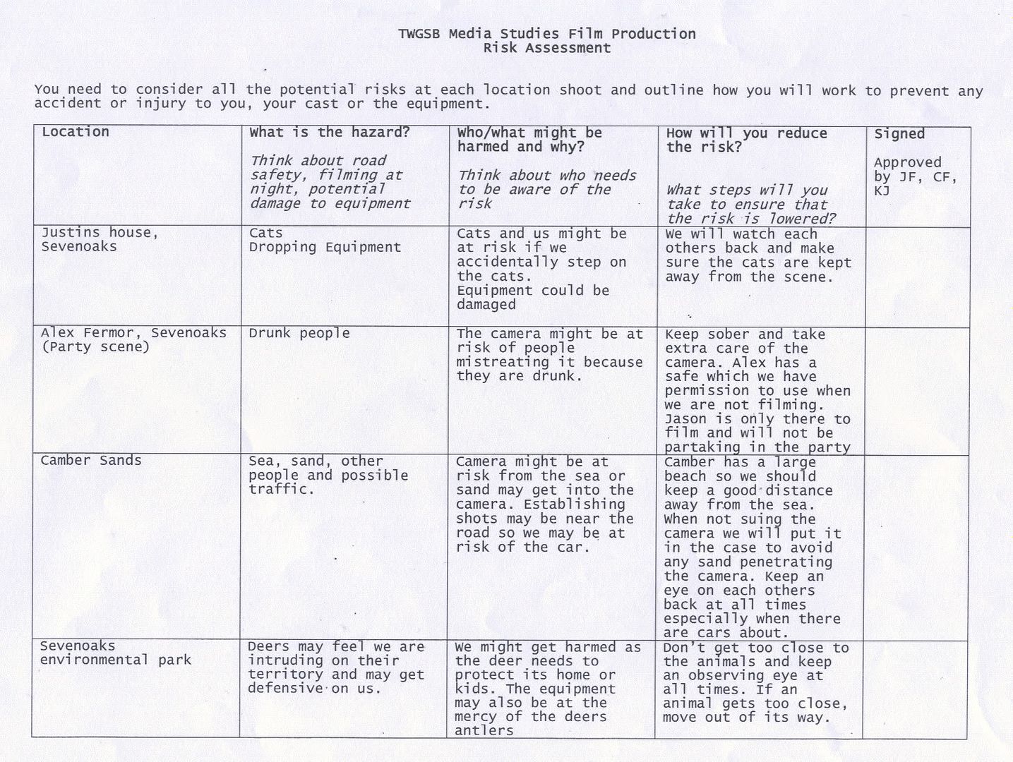
Whilst the making of our music video, planning and evaluating it we have used blogger.com as a collaborative e-portfolio. For example this has helped us document certain parts of our construction such as our storyboarding animatic, and our call sheets and risk assessments when booking out camera equipment.

Planning
• In order to plan our pieces we used a storyboard. This took a while and we thought carefully about each shot.

• We later Turned the storyboard into an animatic as you can see here:


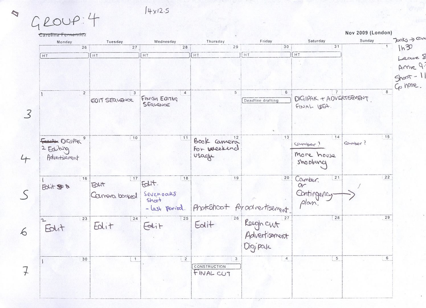
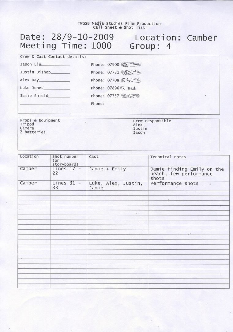
• We used callsheets to organise who was going to be at the shoot, and to make contacting them eaiser with their mobile numbers on the sheet. we also had a dedicated ccalneder to plan the shoots, to make sure no dates woudl clash and to keep track of our progress

PhotobucketPhotobucket
Click to enlarge

• We also had to think about what was actually possible to shoot as oppose to what we would do if we could do anything at all with no limits.
• We created the animatic using Adobe Premiere Elements, this was useful because it meant that when it came to our construction of the music video we could match our video to our animatic. And it helped with clip timing and how many shots we would need.

Editing (Premiere Elements 3.0)

• Using Adobe premiere Elements 3.0 we were able to create some techniques in editing our video.
• The cutting rate was very important, and the cuts had to be on the beats of the music or in time with the lyrics, using the peaks of the music in the audio,it was easy to line up the shots with the beats.
Photobucket
Click to enlarge

• Lighting was a big issue as we shot on differnt days at differnet times we used the image control toolbar to adjust contrast and brightness of the footage.

Photobucket
Click to enlarge

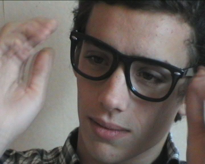
• We used a speech bubble over Justin’s head to show dialogue in the music video, rather than normal subtitles

• This effect was created through making a bubble in Photoshop, saving it as a .png and importing it into premier and changing the size and scale of the picture

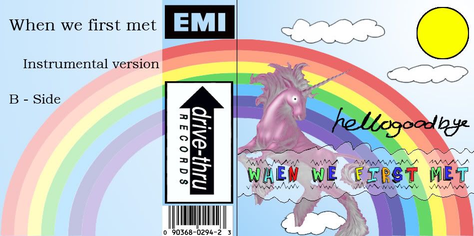
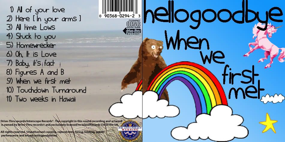
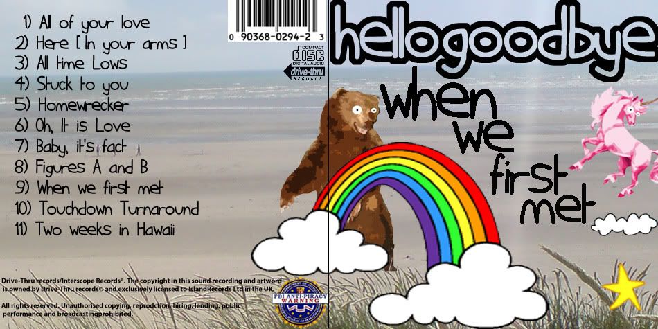
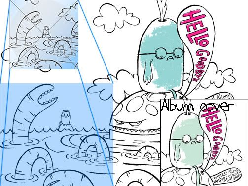
Digi-pak & Advertisement
• We Digital camera to take photographs for our digipak and we the made many ajustments with the lighting and contrast, using the the tools in photoshop

Photobucket

Adobe Photoshop
• In Adobe photoshop we layered our photo with other pictures such as the record label logo and also the use of text
• We also changed our drummer half way threw the shoot, we had to include the prominent drummer in the advert, we had already shot the photo with the previous one,
• Using a range of tools, such as the lasso and selection brush, we cut the face of the new drummer out, and layered it over the old drummers body.
Photobucket
Click to enlarge

MS Publisher
• In MS Publisher we then used leaflet style page as the basis for our digpak and advertisement, as this allowed us to set out specific measurements that we got from magazines and previous digipaks. We set out the page at 14.5x12 for the digipak.

Wednesday 16 December 2009

GW - Evaluation Question 3

3. What have you learned from your audience feedback?

Audience research is key to the knowing of what needs to be done and what the audience would like. Due to the nature of our video, being mainstream, we need to use audience research throughout the stages of our video making. We have used three stages of audeince research;


-Preliminary reseach


-Rough Cut Research


-The Final Cut research


AD - Preliminary Research


> For our preliminary research, we asked an age group of 15 - 30 year olds.


> We used the website www.surveymonkey.com, this way we would reach a much wider audience and recieve the results much quicker.


Photobucket

>We were able to contact the webmaster of www.hgbfans.com, and they were kind enough to post a link to our questionaire on the front page of the website.


>The questionnaire was successful, but with some minor draw backs, as some of the questions were brief and there was a wide variety of answers.


> We have done a full evaluation of the prliminary research previously, and an in depth analysis of the results can be found can be found by clicking this link.


http://twgsbmedia09a2group4.blogspot.com/2009/10/audience-research-evaluation.html


JB - The Rough Cut

After people viewed our rough cut of our video they all had ideas that we could have used to change our video.

>The audience liked the idea of the cow and the gorilla as they though that this was comical but they did not like that they did not see them very much throughout. Because we did not have enough shots of the cow and the gorilla in our second verse we filmed more shots using the cow and the gorilla.


>Also people didn't understand that the female had left the house, so we decided to add in a shot of the empty sofa. This would help people realize that the female had left the house.


>People seemed to really enjoy the shot where the male is sitting on the bench in the park with the leaves underneath his feet.


>Also some people noticed that at the end, when the male and female are entering the house, there are two static shots of them which make it unidentifiable to see which of them is entering. We looked through our footage and found a different shot of the female entering the house. This made it more identifiable and also added some shot variation into that sequence.

>The audience also realized that we had some problems with our stop motion. There was a picture of someones face in one of the shots and also someone hand was in it. We found a way to take out those problems so that it had better continuity.

> The audience said that they thought we needed more close ups of the female. Listening to this we decided to get more shots from our extra footage.


> We showed a rough cut of our magazine advert and the audience thought that it was effective.


>They enjoyed the picture of the band and the background image.


>One problem was that positioning of words and also the font that was used. We took this into account and decided to look make it the same as the font on the digipak.


> We showed our digipak to the audience too.


>The audience did not like the digipak having a black background, so we decided to change it to a blue one instead. It did not continue with the back of the digipak which was an image of the beach so we asked some people what they thought would be good and we came to conclusion that using a picture of the beach would be the best solution.


> Also the audience did not like the idea that we had of putting the band titles on top of the bands faces on the inside cover. So we decided to take this out and put in signatures instead.


JL - The Final Cut


Finally, once our music video was complete we needed to complete the final part of our audience research. We needed to test the audience to show whether our completed work was what we intended it to be and whether the audience liked it

We carried out our a survey on surveymonkey.com, 19 people took part in our survey and found out:

> 16/19 people understood the narrative of a love story.

> 95% of people found the product humourous.

> The majority of people see the band as quite cheerful and comical characters

> 84% of people expected this type of video for this genre of music

> 95% of people would stand for repeated viewings, reasons included:

- "it was cute & creative"

-"made me laugh - entertaining"

-"Really amusing and suited the song brilliantly."

-"funny"

-"because its nice, a pleasent feeling overwhelms me"

-"it's funny and sweet"

We asked the audience to rate aspects of our music video and told them to rate it out of 5. Here are the results on a graph. As you can see, the majority of results are 4 - 5.

Photobucket
The whole objective of making a music video is to promote the band, we asked the audience would they buy hellogoodbye's album after viewing the video, digipak and advertisement and 14/19 said they would. This is a good result as many participants have not heard of hellgoodbye before our music video.

On a seperate occasion we asked 10 people if they felt that our digipak and advertisement suited the genre of the music and 100% of them agreed.


JL - Evaluation Question 2

How effective is the combination of your main product and ancillary texts?


Our brief was to make a music video, magazine advertisement and a digipak for our chosen track. The products that we produced are all subsidiary media to build the image of the band. Hellogoodbye is a powerpop band, this genre draws inspirations from the 60's and is closely related to pop-rock and indie pop music. These genres has many characteristics. People usually wear checked shirts with skinny jeans and are known to be passionate about the music that they produced. Along with this, because power pop draws inspiration from the 60's we tried to build the band image as quite retro but at the same time showing the band as modern and contemporary.

Here are the digipak highlighting icons to show how we contructed the image of the band. I used different visual motifs to general and construct a band image.

Outside analysis


  • As with other powerpop album covers there are not any pictures of the band. Here is a moodboard with album art from other artists within the same genre.

    moodboard


  • As you can see they are all very colourful and have a retro feel to it. The top left has a comic style to it and the Silver Sun cover looks as though it has been taken out of a comic book. I used these to help generate our digipak which lets the consumer identify the band and the genre.

  • As well as following conventional albums with the lack of a band picture it also allows the band to build a personality to the audience of a 'fairy tale' world as mentioned above.

  • It also leaves consumers with an enigma as to why there is no picture and thus the consumer will try and complete this image by viewing other sources of media.

Here is the inside of our digipak, it shows how we continued to generate out band image.


Inside analysis


Richard Dyer

"Star image is incoherent, that is incomplete and 'open'."

Paradox 1: "The star must be simultaneously ordinary and extraordinary for the consumer"

Paradox 2: "The star must be simultaneously present and absent for the consumer"
  • The glasses without lenses builds an incoherent star image, it is seen in the music video as well as the digipak and advertisements.
    Jamie with glasses spooning

  • The cow and gorilla in the music video continues the playful nature of the band and may remain a mysterious as to why they are there so the consumer can carry on to complete their image.

  • The house party they attend and the narrative of the boy chasing the girl can be related by the audience as these are ordinary activities but within the same shot there is also the presence of a cow and gorilla which makes the scene simultaneously ordinary and extraordinary.

  • Another example of Dyers paradox 1 is the usage of handicam shots during performance. It is closely related to home videos but it is extraordinary as the band are performing in a park and are seen to be extremely talented.

  • There is a fast cutting rate for the video. Just as the consumer starts to begin a bond with the band the shot cuts disrupting the relationship making the band simultaneously present and absent.
  • During the performance shots there are first person mode of address but this is only seen during the chorus, as a result this is very brief which gives the band simultaneously present and absent.

Here is our magazine advertisement


  • We plan to put our magazine into NME as they promote music which is of interest to our target audience.
  • It is a full page advertisement as Hellogoodbye are verging into mainstream. It will also give them maximum exposure.
  • We have kept the same font and background so continual consumption of the media products will anchor the bands personality.


Monday 14 December 2009

JB - Evaluation Question 1

In what ways does your media product use, develop or challenge forms and conventions of real media products?


Goodwin


  • The video uses many conventions of the Powerpop genre, which is a fun, upbeat and contemporary genre.


  • Applying Goodwins Framework our video uses conventional costumes and fashion that people would associate with the genre, such as checked shirts and thick framed black glasses. The glasses can be seen as a visual signifier as ironic. Nowadays the ‘geek chic’ look is popular. This helps the audience to identi fy with the band to make them seem contemporary thus increasing popularity.

  • Our video contains lip synching and synching of instruments. This adds realism to the video and gives the artist a more professional look about them.


  • It also contains relationships between the lyrics and the visuals. This is quite subtle but the lyrics are ‘What our days repeat’ and in our video we have made it look like their days repeat by making him go from one party to another. We have amplified the lyrics by using the gorilla and the cow for comical effect.

  • There is a relationship between the sound and the visuals too. The genre is Powerpop is a very upbeat and humorous genre. We have conveyed this in our video by using a fast cutting rate and by using the cow and the gorilla. We had a fast tempo of cuts and fast montage editing at the end during the party scenes.

  • Our video is a narrative/performance/concept based video. It contains performance shots in the chorus and in the verses it contains a narrative. The cow and the gorilla would be the concept part.


Representation

  • The artist does perform in a first person mode of address by looking straight into the camera when singing on some occasions. This can be seen in ‘Hellogoodbyes’ other videos such as ‘Bonnie Taylor Shakedown’. This makes the audience feel a parasocial intimacy towards the band, according to Dyer, and helps them to identify with them.


http://www.youtube.com/watch?v=sawaWOSZ-WU

  • The relationship between the man and woman can be seen as a serious relationship. The man goes out to find her when she is gone, this shows their love. The cow and the gorilla is the oppositeof this relationship. They are in a more humorous relationship. This can be seen by them chasing eachother throughout.

  • The video plays on the conventions that the male is not sensitive. In some normal circumstances the man may be seen as the one to leave in the morning, but in our video it is the female who leaves. This leaves the male as quite vulnerable and shows his sensitive side when trying, and failing, to find her. This could be seen as postmodern because of the irony involved.


  • Within our video we have conveyed character exposition within the sequence when the male and female are on the sofa playing around and socializing. This shows the audience that they are in a relationship and that they like eachother.


    • http://www.youtube.com/watch?v=oeanb9Uf7hI

    • The video conveys a Heteronormative discourse. This is shown by the male and female characters interacting with each other showing that they are in a sound heterosexual relationship, thus showing heterosexuality as normal however at the end we see a splitting up between the two which shows that heterosexual relationships arent always perfect and that friends can be more enduring.


        Concept


        • We have also been playful by using the cow and the gorilla to contradict the relationship between the male and female.


        • Powerpop videos are seen to be quite humorous and playful. We have tried to convey that through our video by using the cow and the gorilla and by being quite lively for our performances.


        Postmodern


        • Postmodernism is a key theme in our video. Iw works with the genre and becomes enjoyable to the audience. We have used these signifiers to create postmodernism within our video.

        • Intertextuality such as the gorilla such as the Cadburys advert where the gorilla is playing the drums.


        • In this video we have used intertextuality such as the Buddy Holly glasses. These glasses can be seen being worn by various different stars such as Buddy Holly, Jay –Z and Woody Allen.


        • We have used intertextuality such as the Television show Skins and Teen movies. These are shown when we used house parties which are commonly seen in these areas.

        Wednesday 9 December 2009

        AD - Final Cut Music Video

        This is our final cut of our Music video, uploaded to youtube so we can embed it, and so we can look at the feed back from the comments.

        Tuesday 1 December 2009

        JL - Audience Feedback Evaluation - Rough Cut

        On Monday we showed our rough cut to the class for some audience feedback and we got some very helpful advice to help improve our work.

        The audience liked the concept of Gorilla and the Cow as they found it quite humourous as a recurring character but felt that there wasn't enough of the cow and gorilla near the end so we have decided to add some filler shots of the gorilla chasing the cow with maybe some special effects.

        A shot that they found interesting was the start of the second chorus with the band moving from one position to another with the camera at one point. Another shot that they were fond of is when Jamie was sitting on the bench with the red leaves surrounding him during the second verse.

        A lot of people didn't understand that the girl has left because we didn't show her leaving nor did we have a shot of the empty sofa so we will have to make it clear that she has left by having her. We decided to do this by having a shot of the empty sofa.

        Overall I felt that it went well. We got some important advice on how to make our work better.

        Tuesday 24 November 2009

        JB - Magazine Advert

        This is our final magazine advertisemnt. This magazine advert is made to be used in a magazine such as NME. I had taken a picture of the four of us and used photoshop to cut out the background. Then I put a picture thatw e had taken of the beach as the background because this is a generic convention of this type of music. I used a cartoony font due to the convention of the genre. Because one of the band members couldnt make it to the photo shoot, we took a photo with someone else and photoshopped our band members face onto his body. I added their myspace and record label at the bottom so that fans can access them easily and I put a picture of the album at the bottom so that fans would know what to purchase.

        Monday 23 November 2009

        JL Weekend shoot Evaluation

        In the weekend we filmed the rest of our music video. In the morning it was quite cloudy and looked as though it might rain, we didn't want to risk getting to Camber and not being able to film so we decided to stick with the contingency plan and film in Sevenoaks in a park.

        We wanted to do another performance shot for the second chorus as well as the remaining parts of the narrative. We did it in a park where there were trees and leaves which didn't match the summer feel of the song as there were brown/red leaves on the floor and the trees were bare. Apart from the leaves the park was a good location. Jamie was sitting on a bench in the field and there was a cliff edge quite close to it where Emily would walk past. This gave us some really good establishing shots from a high point looking down on to the park. We also had 2 cameras which enabled us to use time more effectly to get the best out of the light and we would use one for normal shots and the other for more interesting angles and movement which we may or may not use.

        Although we couldn't go to Camber, I felt that this was a good shoot; we had enough light and it wasn't raining to allow us to film.

        Wednesday 18 November 2009

        JL - Contingency Plan

        Our failed shoot on Saturday due to the rain means we are quite pushed for time if we want to edit to a high standard. We plan to shoot this Sunday at Camber but if the weather is bad again it means it will be another week till we are able to shoot again which leaves us very little time to edit. As a result we have came up with a contingency plan.

        Our plan is to work with the rain and implant it into our music video. We plan to have the two lovers (Jamie and Emily) searching for each other in the rain and when he fails he comes home looking depressed. His friends then come and cheer him up and take him to a party. At the party they meet each other again and kisses.


        Using this narrative of him being indoors gives us the opportunity to film after school as it usually gets dark fairly early. It also means we don't be able to shoot if it rains.

        Monday 9 November 2009

        AD - First shoot - Outtakes

        We shot so much footage on our first shoot we had a few outtakes, so in our free time we compiled this short video.

        JL - Organisation and Planning

        Here is our planning and organisation to make sure that everything is done on time. Please click on the scans to enlarge them.

        This calendar helped us organise our shoots and when we needed to edit the footage, it was important to manage our time because it allows us make changes if anything unplanned occurs.
        Photobucket
        This is the call shot for one of our shoots. We used this so we can get in contact with our crew easily and so we know what we are doing on the day of the shoots
        Photobucket
        This is a risk assessment. We use this to make sure we know of any hazards that may occur and make an effort to reduce the chances of an accident happening.
        Photobucket

        Thursday 5 November 2009

        JL - Digipak ideas development

        (click on images to enlarge)
        As a group we decided that to have a digipak with 4 sides Photobucket

        For the outside we will have the traditional album cover with tracklistings on the back and the inside sleeve will have members of the band and then the CD will have something subtle as there will be a cd covering it.
        Front Cover

        1.Justin Bishop2.Alex Day3.Jason Liu

        As you can see, these are the ideas for front covers that we had. Number 1 looks good and is relevant to our music video as we have a couple by the beach but it doesn't follow traditional conventions of powerpop songs as seen in our mood boards so if someone saw this in a shop, they may not known that it is powerpop or hellogoodbye.

        Number 2 and 3 were stronger contenders, they both had similar elements but we thought that no. 2 is more suitable as the colours were stronger but it seemed really dark because of the background so we are going to add a bright blue background similar to the one of no. 3. here is the result:
        Photobucket
        The font seemed very pixellated and when we tried writing the track listing in this font, it was very difficult to read and as the font was downloaded from a 3rd party a lot of characters were missing so we had to change the font. We went through dafont.com to pick a font and here were some of the contenders.


        Some font ideas
        As discussed in the comments below 1 and 6 were seen to be more suited for the album as these were generally thinner making them more readable if they are smaller. We implemented this into our album cover and this was the result.
        Photobucket
        We then put it with our back cover and realised that we had a background of the beach on one side and then a blue background on the album cover so we had to stretch the picture of the beach across the two to have a continual theme. Here is the contradicting background
        Photobucket
        This means that when people open up the digipak it will be seen as one big image and not two separate sides. Here is the picture I will be using as the background, I took this picture when I went on my location reccie to Camber Sands


        Here is the stretched background, I also inverted the colour of the band name so it is easier to see and more eye catching.
        Photobucket

        Inside
        Photobucket
        As you can see from the idea above we wanted to show the band members as individuals and thought that the cur out faces of the band would make it more retro and give them individuality and the close up will build personality. At this stage we didn't have pictures of the band so we used the real band instead. The CD side will have a more subtle picture as they usually have a CD covering it, so I decided to use an abstract image which is seen on other hellogoodbye albums.

        Photobucket


        Here I added our faces. We have the same problem as we did with the front. The CD sleeve and the CD cover did not match backgrounds so we had to change the background, it was didn't relate to the front so we had to have something similar to a beach.
        Photobucket
        We have the same problem as we did with the front. The CD sleeve and the CD cover did not match backgrounds so we had to change the background, it was didn't relate to the front so we had to have something similar to a beach. As we are having an image as the background and not a gradient of colour it means we have to abandon the plan of having the worms.

        I added a picture for our background and this is the final results for the inside of our digipak. I also included signatures as a way of the band being closer to the audience.

        As you can see the picture continues the theme of the beach and the ball is round which would suit the CD nicely.
        Photobucket

        So here is our final print products

        Outside
        Photobucket
        Inside
        Photobucket
        (Click to enlarge)

        Tuesday 3 November 2009

        JL - Party Shoot Evaluation

        In the final sequence of our music video we planned to have party scenes of people dancing. As it was difficult to get a lot of people round our house we decided to attend a house party to get our footage, this also eliminated the chances getting our house messy. For safety puposes we kept the camera safe and never let anyone else touch any of the equipment.

        We needed a lot shots of people dancing and having fun and I feel that we have achieved this but a major problem that we had was the house we went to didn't look like Justins house. Another problem was that not everyone was dancing, most people were chatting, so we had to co ordinate everyones dancing so that they were dancing in the way that we wished. We had to tell people where to stand and where they could not go so that they did not ruin the shots.

        Monday 2 November 2009

        JL - Digipak Ideas

        Here are an idea for a digipak for our music video.

        (Click to enlarge)

        Outside
        Photobucket
        Inside

        Photobucket