
As a group we decided that to have a digipak with 4 sides
For the outside we will have the traditional album cover with tracklistings on the back and the inside sleeve will have members of the band and then the CD will have something subtle as there will be a cd covering it.
1. 2.
2. 3.
3.
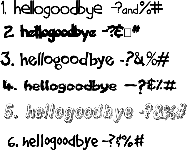
 The font seemed very pixellated and when we tried writing the track listing in this font, it was very difficult to read and as the font was downloaded from a 3rd party a lot of characters were missing so we had to change the font. We went through dafont.com to pick a font and here were some of the contenders.
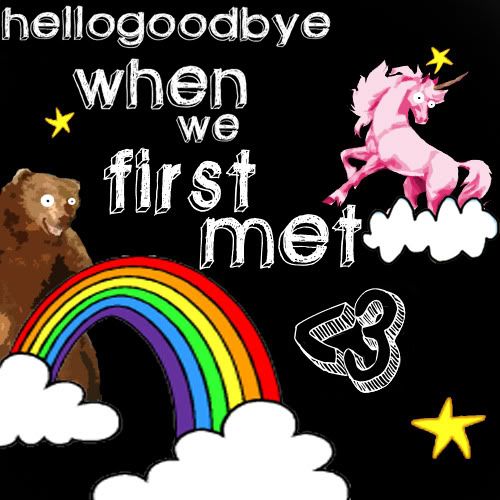
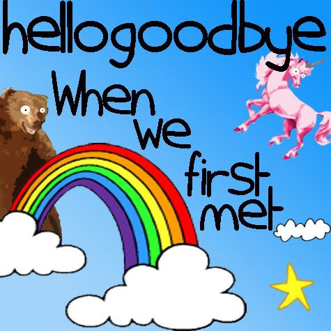
Front Cover
 2.
2. 3.
3.
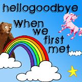
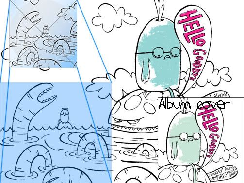
As you can see, these are the ideas for front covers that we had. Number 1 looks good and is relevant to our music video as we have a couple by the beach but it doesn't follow traditional conventions of powerpop songs as seen in our mood boards so if someone saw this in a shop, they may not known that it is powerpop or hellogoodbye.
Number 2 and 3 were stronger contenders, they both had similar elements but we thought that no. 2 is more suitable as the colours were stronger but it seemed really dark because of the background so we are going to add a bright blue background similar to the one of no. 3. here is the result:
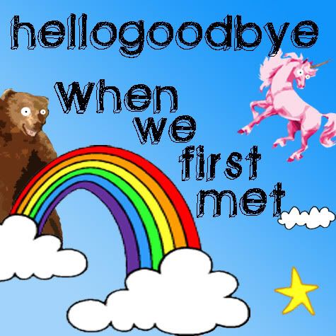
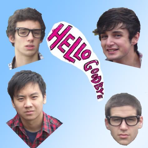
As discussed in the comments below 1 and 6 were seen to be more suited for the album as these were generally thinner making them more readable if they are smaller. We implemented this into our album cover and this was the result.
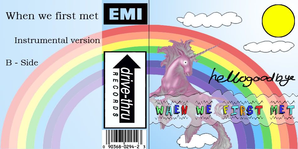
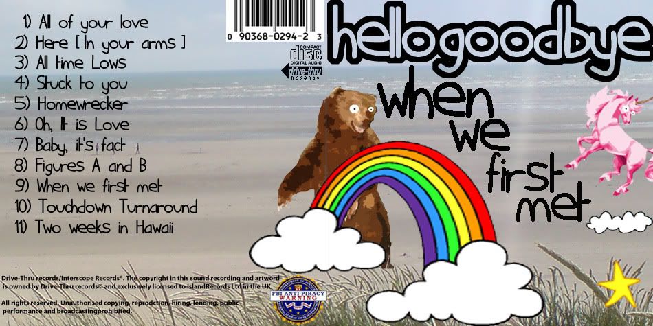
We then put it with our back cover and realised that we had a background of the beach on one side and then a blue background on the album cover so we had to stretch the picture of the beach across the two to have a continual theme. Here is the contradicting background
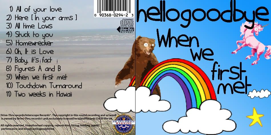
This means that when people open up the digipak it will be seen as one big image and not two separate sides. Here is the picture I will be using as the background, I took this picture when I went on my location reccie to Camber Sands

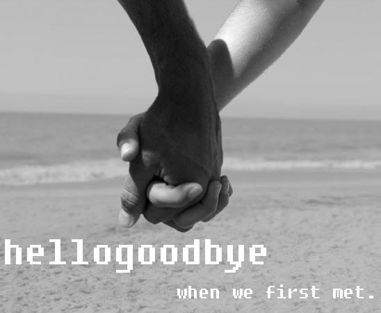
Here is the stretched background, I also inverted the colour of the band name so it is easier to see and more eye catching.
Inside
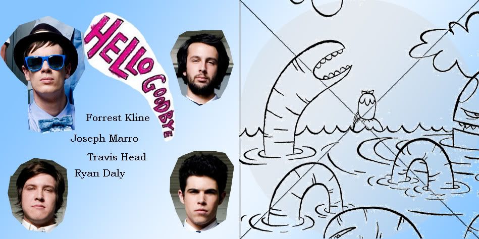
As you can see from the idea above we wanted to show the band members as individuals and thought that the cur out faces of the band would make it more retro and give them individuality and the close up will build personality. At this stage we didn't have pictures of the band so we used the real band instead. The CD side will have a more subtle picture as they usually have a CD covering it, so I decided to use an abstract image which is seen on other hellogoodbye albums.
Here I added our faces. We have the same problem as we did with the front. The CD sleeve and the CD cover did not match backgrounds so we had to change the background, it was didn't relate to the front so we had to have something similar to a beach.
We have the same problem as we did with the front. The CD sleeve and the CD cover did not match backgrounds so we had to change the background, it was didn't relate to the front so we had to have something similar to a beach. As we are having an image as the background and not a gradient of colour it means we have to abandon the plan of having the worms.
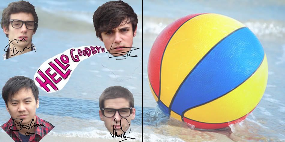
I added a picture for our background and this is the final results for the inside of our digipak. I also included signatures as a way of the band being closer to the audience.
As you can see the picture continues the theme of the beach and the ball is round which would suit the CD nicely.
So here is our final print products
Outside
Inside
(Click to enlarge)
I think that 1 and 5 are quite good fonts for this genre.
ReplyDelete